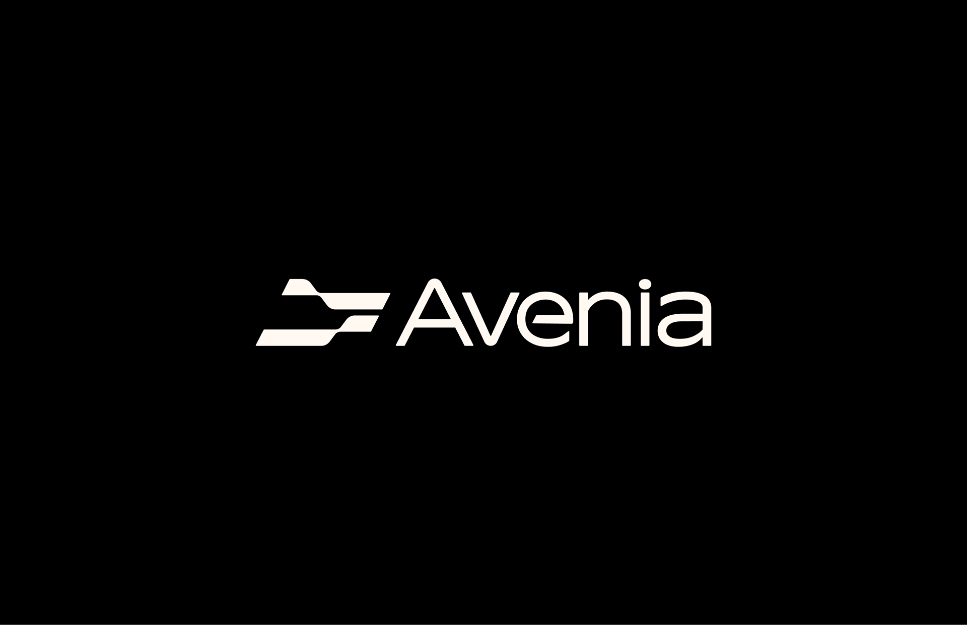
AVENIA | BRAND UPGRADE | 2025
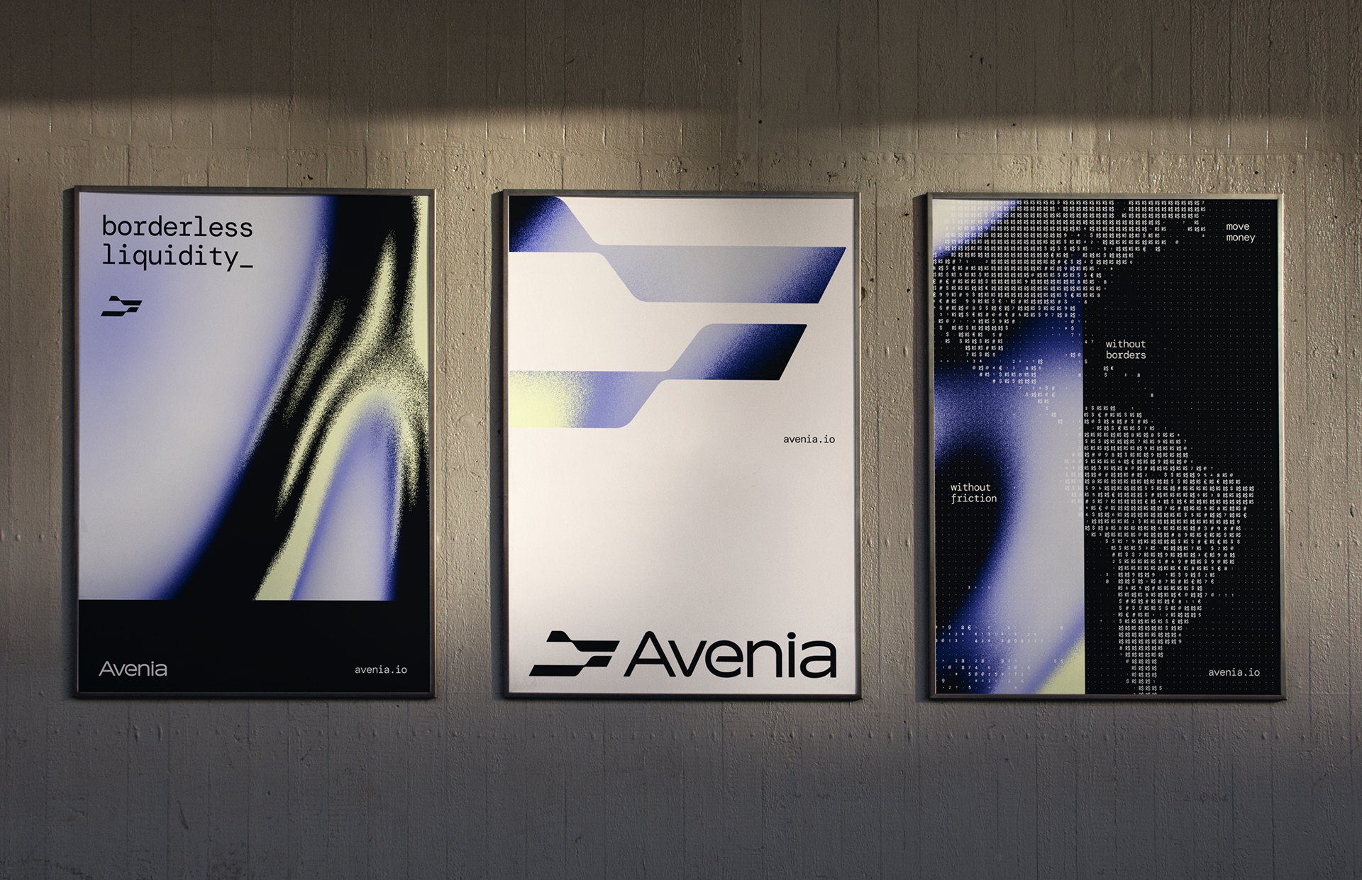
Borderless Liquidity_
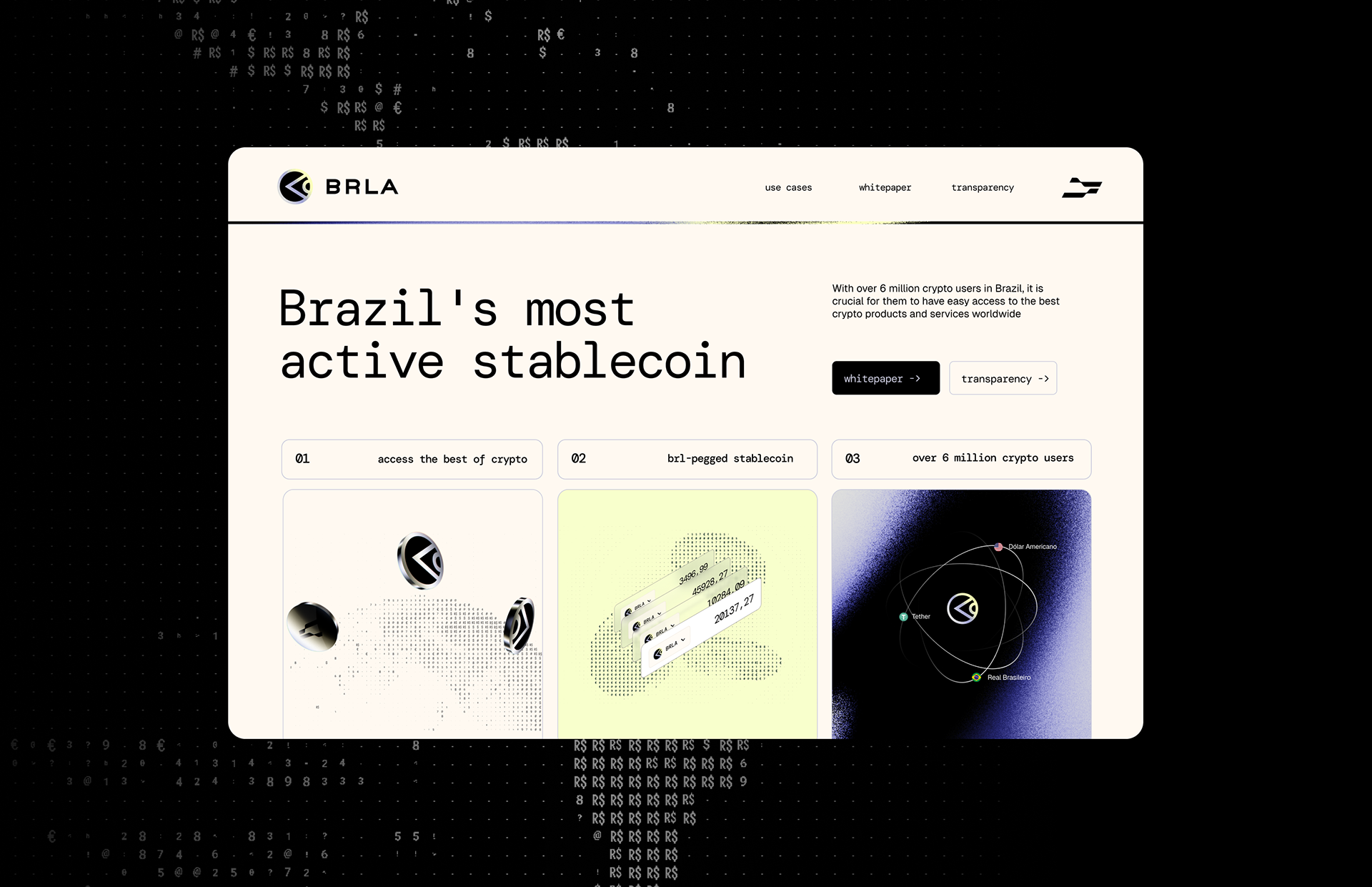
A reference in stablecoins in Brazil, BRLA takes a decisive step toward the future: from Brazil to Latin America, from Latin America to the world. The rebranding emerges as the final touch, celebrating the completion of a R$12 million seed round and the transition to a new name: Avenia.
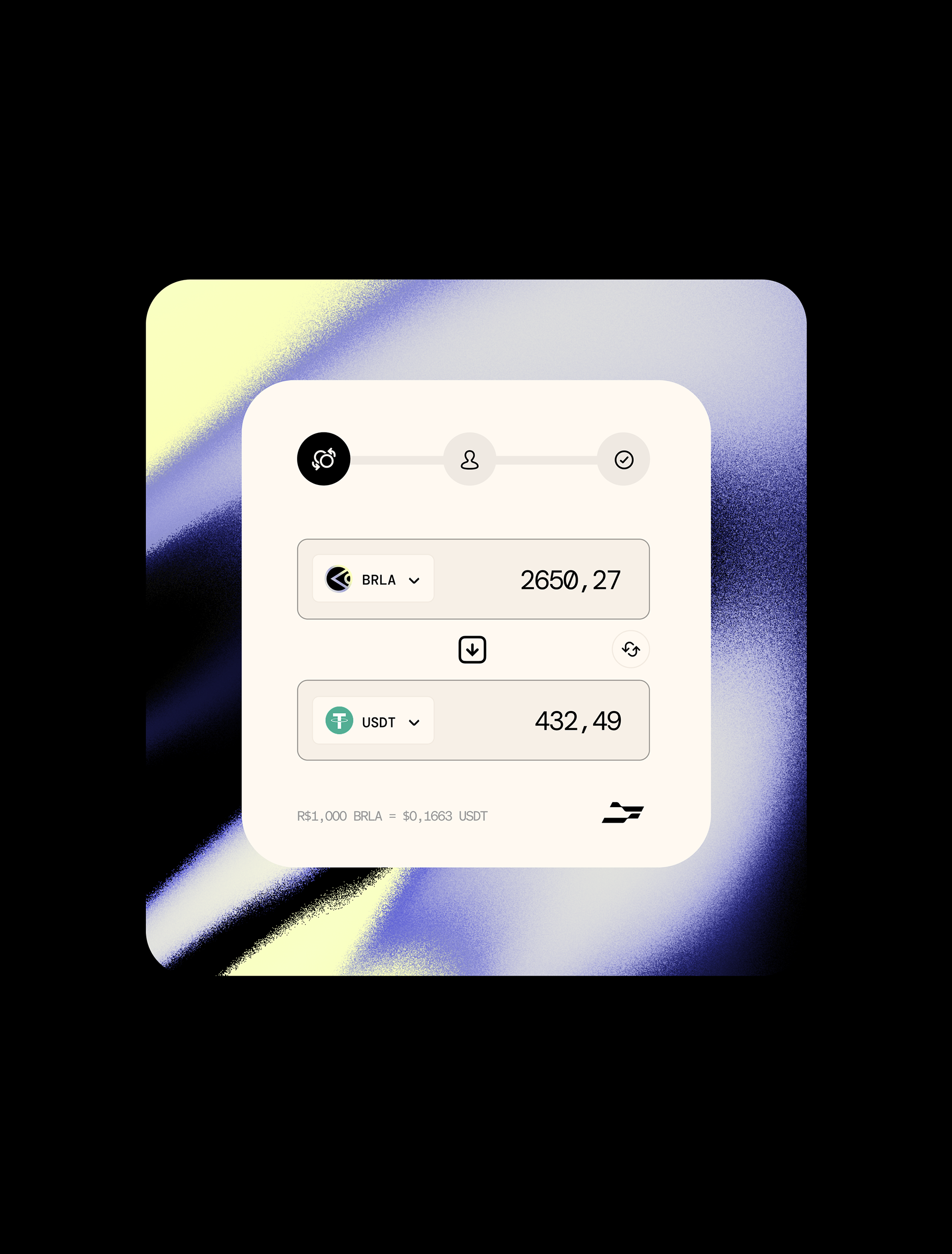
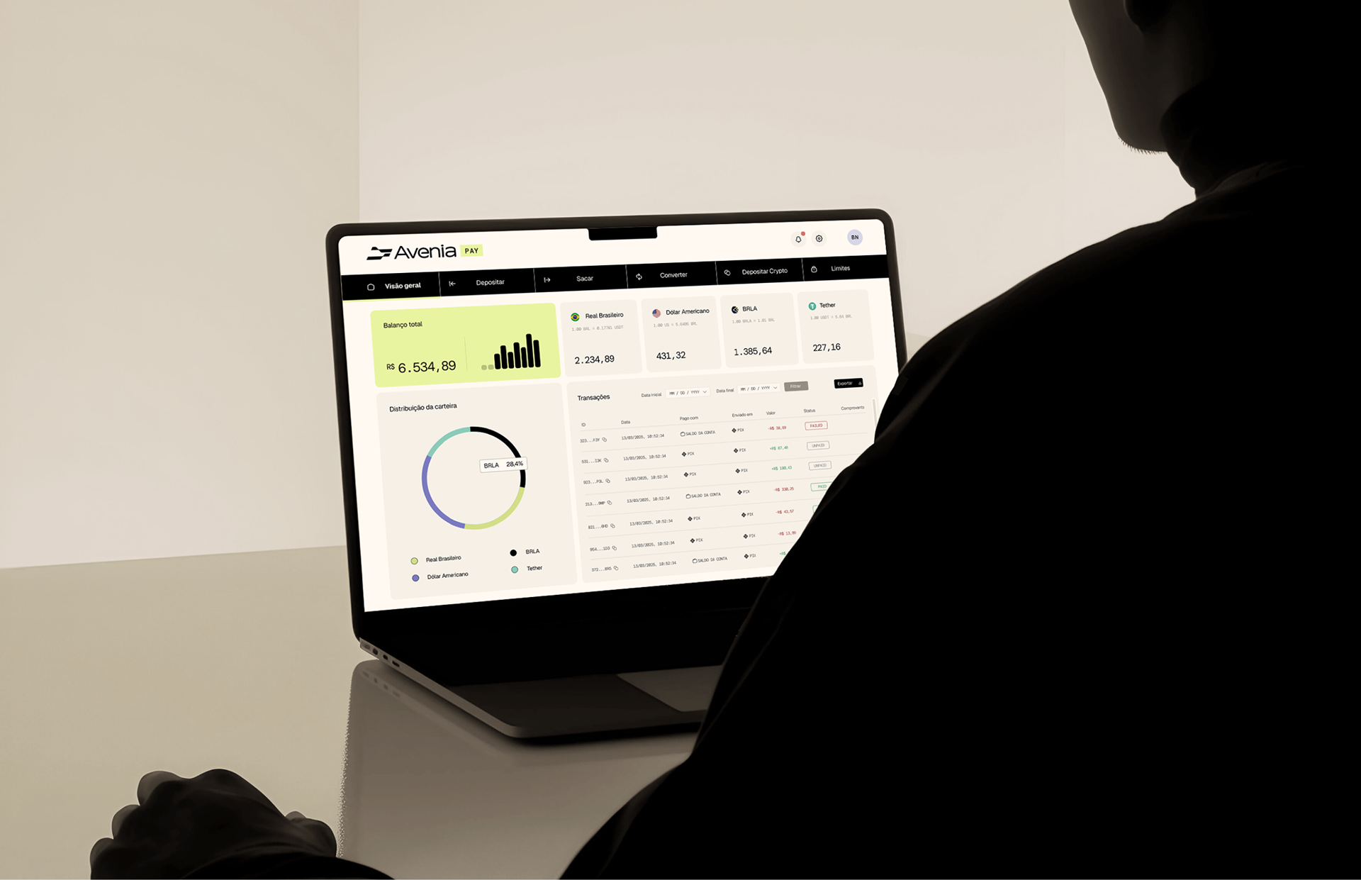
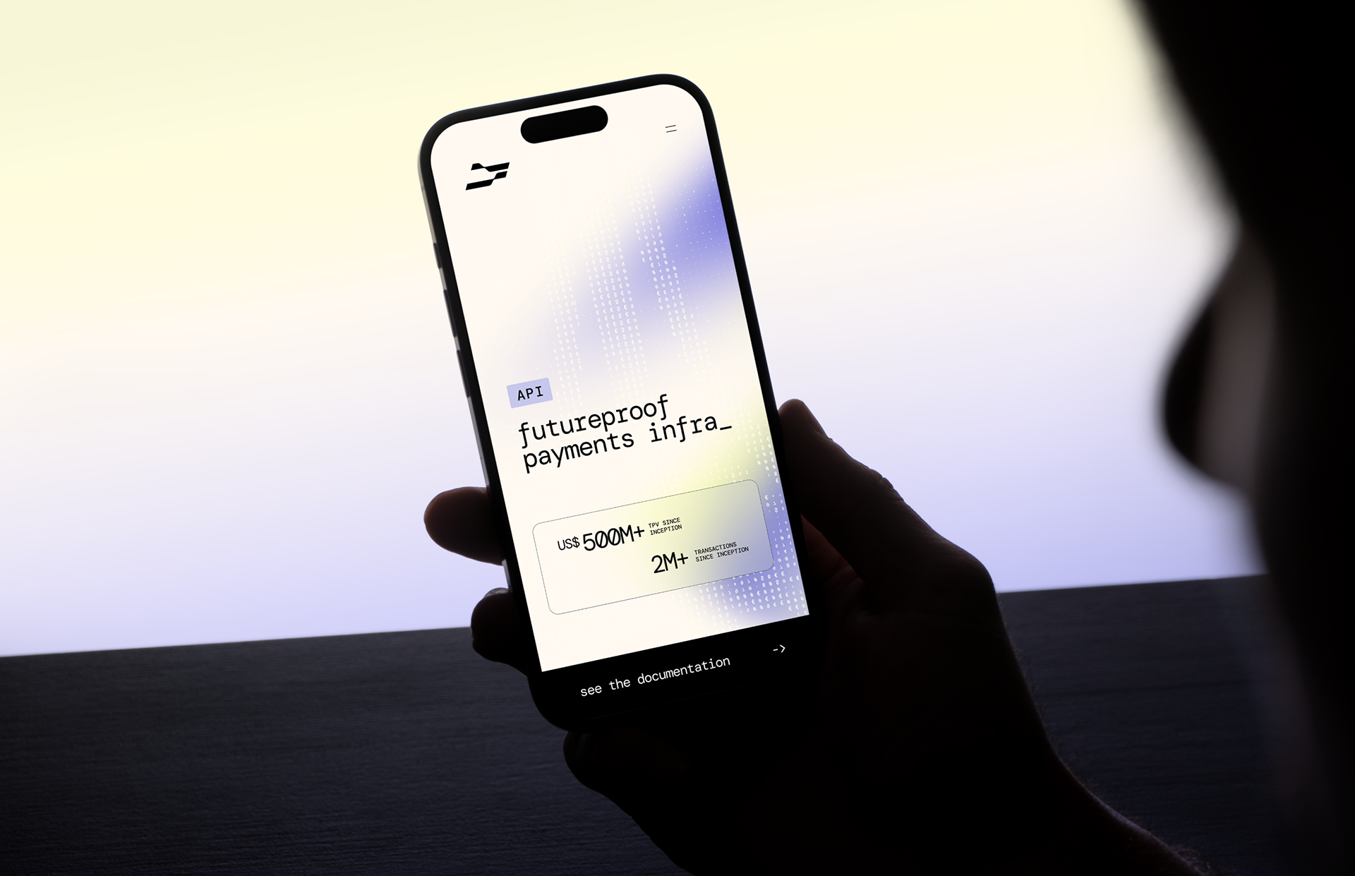
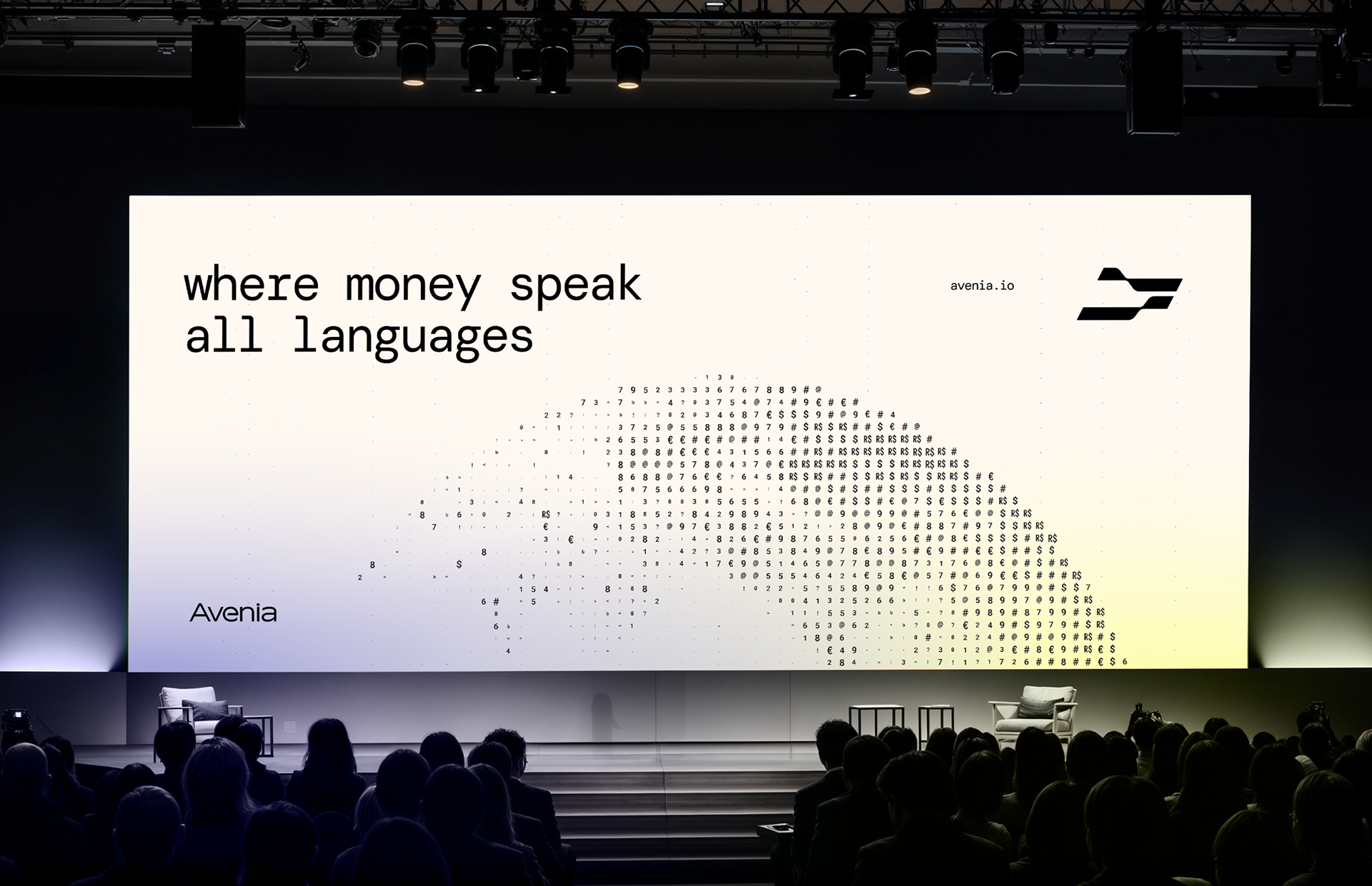
Avenia is an infrastructure that enables the secure, efficient, and borderless movement of money.
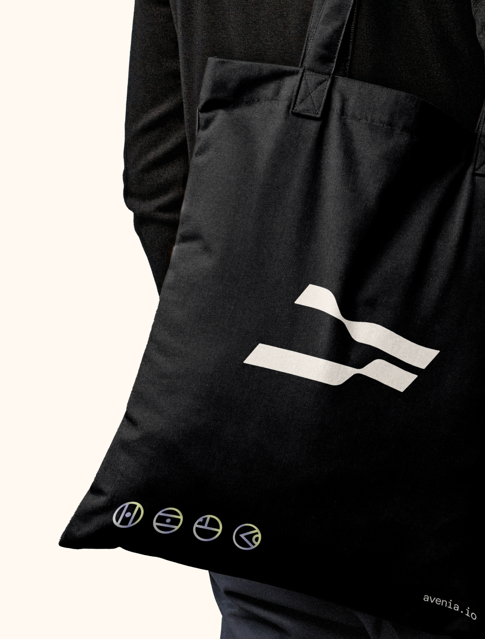
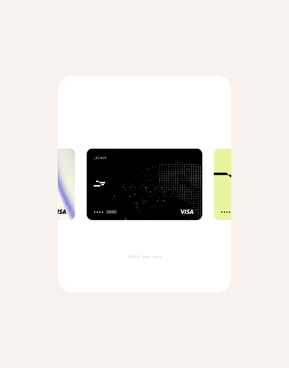
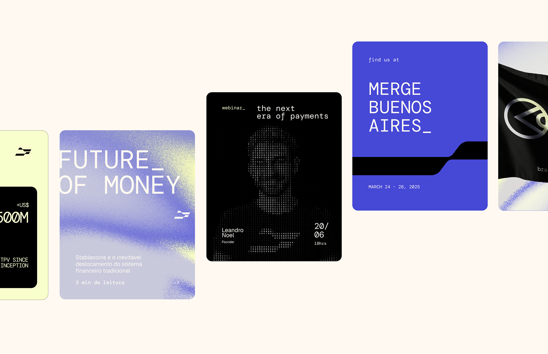
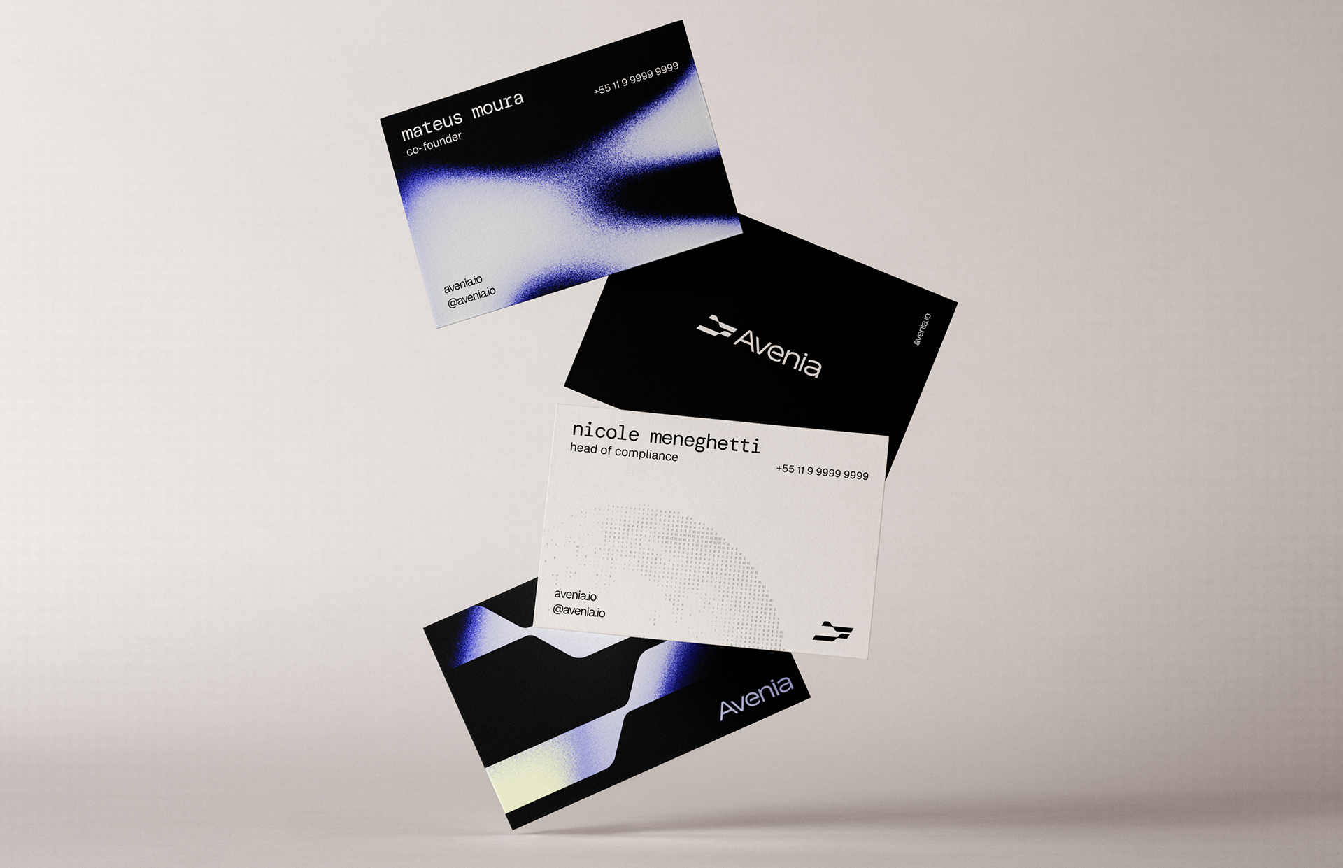
The creative concept is rooted in the idea of "fluid stability" — a union of robustness and stability with fluidity and flexibility. The symbol embodies this essence: structured, yet malleable and adaptable, reflecting the dynamic nature of the digital financial system.
The creative concept is rooted in the idea of "fluid stability" — a union of robustness and stability with fluidity and flexibility. The symbol embodies this essence: structured, yet malleable and adaptable, reflecting the dynamic nature of the digital financial system.
The inspiration for the name comes from avenues, representing movement, direction, and connection. Graphic elements incorporate numerical and typographic references — universal codes of money and technology. The gradient expresses the idea of liquid boundaries, dissolving geographic and financial limits. Soft colors reinforce the sense of fluidity, ease, and lightness, while the typography conveys security and solidity.
This project marks a new chapter for Avenia: establishing itself as a fundamental infrastructure for the circulation of value on a global scale, with design and purpose aligned to a vision of the future.
_
Creative Direction: Bolívar Nunes, Paula Nunes e Marcella Fontes
Strategy and Tone of Voice: Bolívar Nunes, Paula Nunes, Marcella Fontes e Gabriela Balza
Design Support: Gabriela Balza
Vídeo/Motion: Klayton Fadul
Design Support: Gabriela Balza
Vídeo/Motion: Klayton Fadul